TA Charts - Legend and Explanation
Neo TA Charts is a charting application that displays the key neoclassical technical analysis events on a standard candlestick chart. The concepts of anchor bars and zones, swing points and trends are all displayed on the chart as automatically generated by our patent pending software technology.
Neo TA charts goes where other charting services dare to venture - into the neoclassical world and exposes those key concepts visually. This component integrates with other Neo TA components as well.
TA Charts and Neoclassical Thought
In neoclassical thought, there is qualified trend, swing points, anchor bars and zones. From these four notions, one can determine likely market direction on a given time frame as well as well buyers and sellers likely lurk. That is the promise of neoclassical thought and the patent pending TA charts reveal those key elements. They are update nightly and reflect the evolving nature of the market.
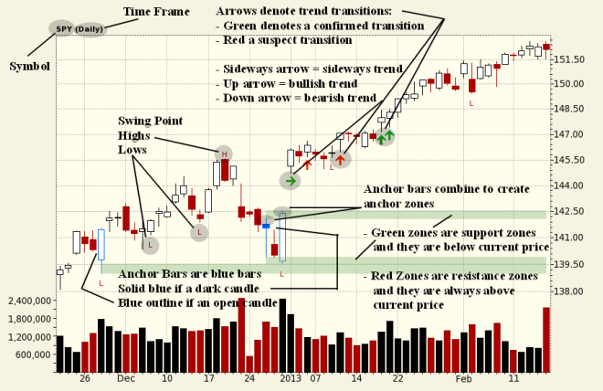
The following chart is marked up to show these key elements.

Swing Points
Swing points are denoted as (L)ow and (H)igh markers on the chart. Swing points are utilized to determine trend.
Trend Transitions
When a swing points is surpassed on a closing basis, that causes trend to transition. The transition can be a reaffirmation or a change to a new change.
A reaffirmation occurs when trend transition to the same trend. An example would be a suspect bullish trend transition to another suspect bullish or even a confirmed bullish trend. The latter case would create a stronger trend while the former would be of the same strength.
Trend transitions are denote with arrows. A red arrow denotes a suspect trend transitions while a green one denotes a confirmed trend transition.
Trend can be either bullish (up arrow), bearish (down arrow) or sideways (sideways arrow) and will always be red or green to denote the suspect or bullish qualification.
Anchor Bars
Supply and demand is evident on the charts in the form of anchor bars and zones. Anchor zones are created via the combination of anchor bars. Anchor bars are the result of an algorithmic formula that examines the characteristics of each bar with respect to
- Volume
- Wide Price Spread
- Swing Points
To be a high volume or wide price spread bar, the volume or wideness of the spread must be greater than the average of all other bars multiplied by 180%. Only six high volume and wide price spread bars are allowed per time frame.
Once determined, each anchor bar is ranked in importance and combined with other anchor bars to create zones (see below). The ranking system considers the rank of the bar and the proximity of the bar's high or low to the current price.
Anchor bars are denote as blue bars while all other bars are black or red. The chart is constructed via candlesticks and each bar is colored based on this formula:
- Red body if the close on this bar is lower than the open and lower than the close on the prior bar (unless an anchor bar)
- Black body if the close on this bar is lower than the open and the close is higher than the close on the prior bar (unless an anchor bar)
- Black outline and white body if the close on this bar is higher than the close on the prior bar (unless and anchor bar)
- Blue body if the close on this bar is lower than the close on the prior bar and this is an anchor bar
- Blue outline and white body if the close on this bar is higher than the close on the prior bar is an anchor bar
Anchor Zones
Determine a price area where supply and demand are evident is the ultimate desire for timing entry and exit. TA charts does just that by combining anchor bars (overlap and congruency) to create anchor zones. Anchor zones always are either above the current price; below it; or within it.
Anchored support zones are colored a soft green and are either equal to or below the current closing price.
Anchored resistance zones are colored a soft red and are above the current closing price.
The exact algorithm for anchor zone construction is proprietary but essentially there is a weighting system that combines the three type of anchor bars along with a relevance factor to determine which of the many anchor zones are currently applicable and should be utilized/monitored.
Component Integration
Clicking on the stock symbol/company names pops up the Trading Cube so that you can get a quick look at the qualified trend of this stock on all times frames as well as the sector and general market.
Other Features
Neo TA Charts are available as pop-up charts as noted above. Pop-up charts carry a clone button so you can easily pull up another one if desired.

